
As a business coach at Unknown University of Applied Sciences, Jeroen Coelen guides students along in their start-up journey, as he provides coaching opportunities where students can expect honest feedback, inspiration, and relevant advice. Jeroen uses his expertise in navigating the early stages of start-ups in order to inspire students to begin new ventures with confidence. With his blogs, Jeroen offers practical tips on developing problem-fit solutions, suggests ways to better understand your customers, and recommends frameworks that help make sense of the chaos of start-ups. We are lucky to host Jeroen’s blogs, as they provide unique insights regarding the nature of the start-up process, continue reading below.
Table of Contents
- Surveys suck and are not relevant for very early-stage startups.
- Sometimes, you need to do a survey. Yikes.
- You can make them suck less.
Keep in mind when selecting questions
1. People don’t like doing surveys
You hate surveys right? It seems that most people that craft surveys don’t realise that people hate surveys. If they engage with the survey, it’s because they are upset or they want to help you. Make it easy for them to help you.
It’s like helping someone move. Moving sucks, but I like helping my friend. If I arrive and the stuff is not packed in boxes, I’ll get angry.
Tip 1: Tell them how long it takes in the email or message. Make sure this is accurate. If you say 3 minutes, I’ll get impatient after 7 minutes.
Reminder: Most people won’t even click on the survey link. At Werkspot, about 10% clicked on the satisfaction survey link. It can be that bad.
2. Realise what people can answer
People are quite good at listing their past behaviour. They are less capable of giving their deep motivations in a form. People say they care about the environment as a buying motivation but they still buy airplane tickets.
The question on the left probably has more accurate answers than the one on the right. In your analysis, you should realise that.
Tip: Try to learn about motivations in a qualitative setting, as you can ask follow-up questions. Quantify these only if really needed for decision making.
3. Don’t ask about future behaviour
People are notoriously bad at predicting the future, let alone their behaviour.
Don’t ask if they would like certain features or whether they would buy something for €60. That is likely to give you untrustworthy data.
Tip: Read the Mom Test & Talking to Humans to learn more about this
4. Simulate data to check the relevance of a question
Sometimes I encounter questions such as:
“What is the reason that made you buy a candy bar”?
[ ] The flavour
[ ] The packaging
[ ] The brand
[ ] Other
Is this helpful? Do a quick random simulation:
Try to think of some arbitrary outcome: 60 votes for flavour, 10 for packaging, 20 for brand and 4 others. Ask yourself: What are you going to conclude from this? People like flavour in a candy bar!? Colour me shocked. We already knew that.
What if we get 20 votes on flavour, 40 on brand 10 on packaging and 10 on others. What does that mean? That our brand is top-notch? Are you then not going to spend attention on flavour?
What people try to do with these questions is to get validation on the benefits or USPs that they imagined their solution would have.
I’ve yet to see an example where these types of questions work well for pre-product startups. I would skip them.
5. Rethink your demographics question
Often, people have a demographics question. Age, job, gender, location. Are those the best ways to segment your users?
I removed the age and gender questions in surveys at Werkspot. Didn’t offer me anything else in analysis.
Would it be interesting to see..
- If you are their favourite solution?
- What other solutions do they use to solve similar problems?
- How often do they use your solution?
As ideas to segment your customers.
6. Run 5 pilot tests before distributing
Your first survey will have mistakes. Questions that are unclear, wrong order, wrong question types (radio buttons instead of checkboxes). Run a couple of pilots. That means:
Sit next to a person that completes the survey. Ask them to think out loud. Don’t help them, as you won’t be there when others will complete the survey. See them struggle. You can also do this over Zoom.
If a question is unclear for one person, you can probably phrase it better. Update that question. You don’t need to wait for 5 people to say that a question is unclear. In between pilots, make small changes. Iterate.
Tip 1: A pilot is not sending 5 surveys to people over email and see if results come in. The survey software is likely to work.
You are not testing the software, you are testing your design capabilities.
Tip 2: Record the time your pilot tester takes to complete the survey. You can use that in your invite email.
7. Always add an open field and option for contact details
Someone gave me this tip once: Add an open field at the end “Anything else we should know?”, non-required. Add an email address field too, non-required.
These things can be goldmines. It’s extra stuff your customer/respondent wishes to share and potential users to interview.
Tip: Make sure you highlight in the question that it is not required. “Leave your email if you want to discuss things further”
Survey UI/UX
8. Remove that 4 paragraph epistle explaining your research
Let’s say I’m in that 10% that clicked your link. You should be thanking me. The first thing I don’t want to encounter is 4 paragraphs that explain the purpose of your survey.
Most people don’t care about why you are doing that survey. People understand that if Spotify emails me with a survey about my experience, that probably they want to understand my experience.
And then? They are going to print my results and distribute them in the streets of Pyongyang. I don’t care.
If the information you are asking is not that private, people don’t care too much about your privacy policy. Most people don’t read anyway.
If you keep it scannable, people will read. A couple of paragraphs is a definite skip. You could add a link to the intro to a page elsewhere for people that want to read more.
Keep it short, stupid. (Ironically this is the wordiest tip)
9. Fewer questions = Higher completion rate
You want completed surveys. Every question reduces the chance someone completes your survey.
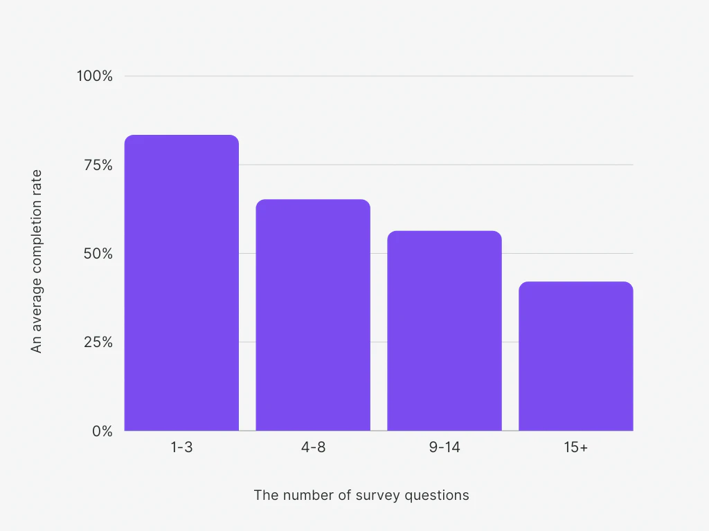
That’s a clear pattern, isn’t it? Remove any questions you don’t need. Avoid survey fatigue. Period.
10. Move boring questions to the end
A lot of surveys start with asking about my age. My gender. My location. That’s boring stuff. I’m here to tell you about my experience with your startup. Front-load those questions.
When I encounter those questions at the end, I’ve already helped you with my insights on my experience.
I’m ‘pot-committed’ as they would like to call in poker. After answering a couple of question that wasn’t excruciating, I’m willing to slide in some demographics ?.
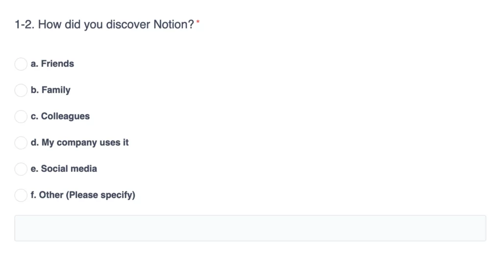
11. Start with an easy question
The order of questions should not be your order of analysis. Designing a survey is like designing a website, an app. It’s UI/UX. It should be a pleasant experience.
Someone on Twitter approached me with this survey about my experience with Notion. This was the first question.
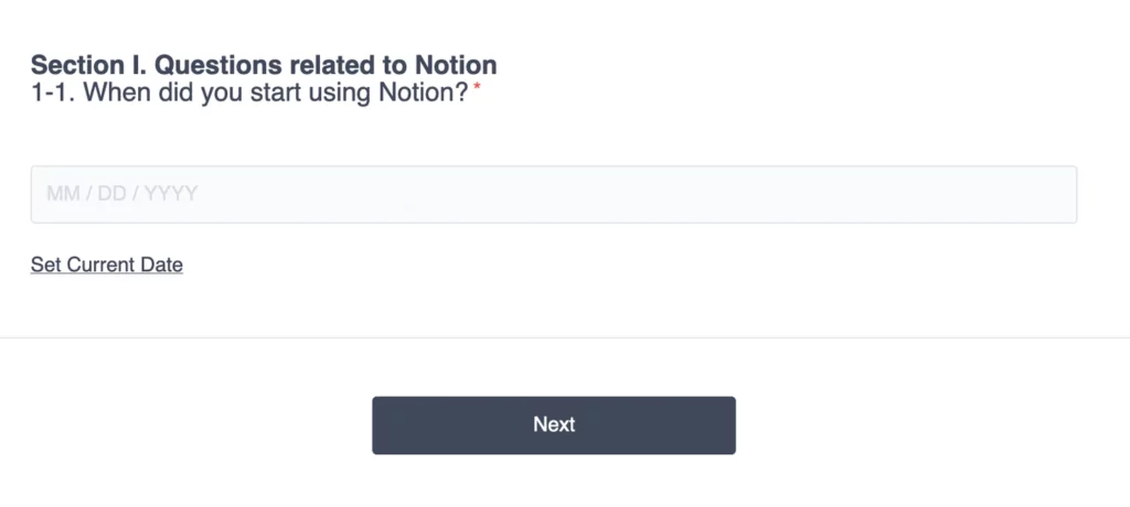
This is a hard question. I need to think back like “ooh when was that, was. Is it 3 years ago? I’m not sure.”
And then it asks me for a date. The exact fucking date. I mean I sometimes forget my best friends birthdays, and you are asking the specific date I started using a tool I’ve been using for, I do not know, 5 years?
Asking a specific date allows you to calculate the number of days. Does the author of this survey need that? I can’t tell. But, I would have this question in an easier way:
A. Less than 6 months
B. Between 7 and 12 months
C. Between 13 and 24 months
D. More than 24 months
Tip 1: You should know from qualitative interviews what the range of answers is that you can expect here.
Tip 2: Make sure you don’t have ‘less than 6 months’ and ‘between 6 and 12 months’ as answers. That confuses people that are in their 6th month.
12. Enable question flow: Get inside your user’s mind
The next question was easier. I got to learn about Notion via a workplace. So within 1 second, I could recognise the right answer, D.
13. To skip or not to skip
If the author would’ve switched these two questions around, it would’ve been easier for me to remember. I would be in flow of questions. First, remember where I heard about it. Then remembering how long ago that was.
Tip: Crafting a survey is like crafting a user interface. It’s a design activity. Think about that user.
That first question, I wanted to skip, but I couldn’t. Then I stopped doing the survey.
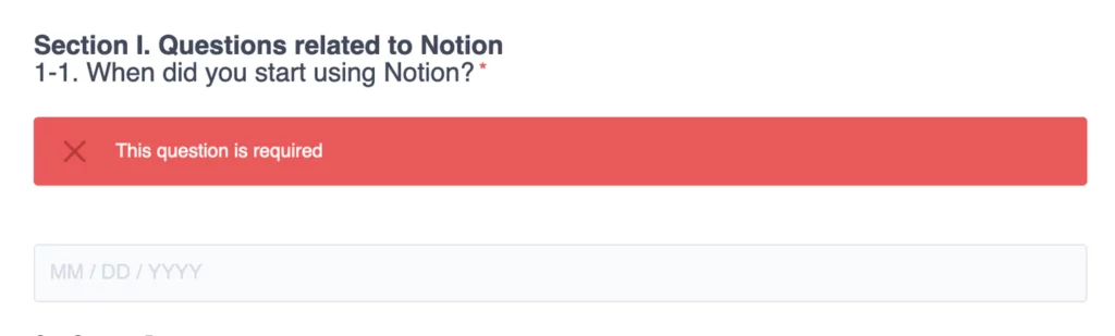
Should you make questions required? It’s a balance between drop-off and information completion. I rather have an incomplete survey than a not completed one.
SurveyMonkey highlights:
- People are more likely to stop the entire survey if they are forced to answer personal questions (35% drop vs 9% drop)
- Research shows that when people are forced to give an answer, they are less honest
- People tend not to skip questions even if they have the opportunity.
Only if you really need the answers, do it.
Tip 1: Check if your survey software records incomplete responses. Google Forms doesn’t offer this.
Some of the surveys I designed had 50% drop off rate. By checking this, I could learn at which question people lose interest.
Tip 2: Add a ‘don’t know’ or ‘prefer not to answer’ to those required questions. This reduces drop off (36% vs 9%)
14. Respect the mobile user
Probably you design your survey on your computer. Very likely, your user will be on mobile. At least 50% of your users will be, if not 90%.
Make sure you run a test on mobile. That means, opening the survey on your phone while designing it AND running a couple of your pilots on mobile.
Tablets are much less common, I always assume if mobile and computers work that tablets will have no problems. A quick self-check would be enough.
Some survey software, like TypeForm or GetFeedback, is designed for mobile, whereas Qualtrics is less mobile user friendly in my experience.
Tip: Let your pilot show whether it works on mobile.
Make the most of your tools
15. Use custom fields to remove questions and supercharge your analysis
Sometimes in surveys, I encounter that I need to add information that I know this company has. What you can do in surveys is custom fields.
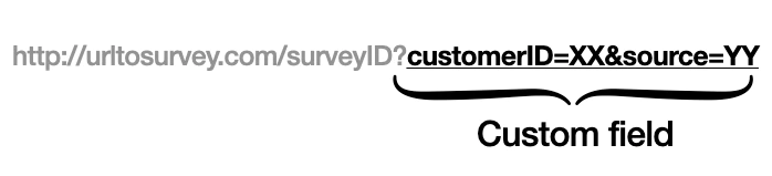
It’s extra parameters added to the URL you use to share the survey. They are recorded as responses in the survey software. Most survey software, including Google Forms, has this functionality.
Tip: Most survey software have very decent documentation on how to use custom fields.
They do come in different names, at TypeForm it’s called Hidden Fields. This would require some fiddling to find the right word your survey software uses.
Supercharge analysis
If you are emailing customers, you could add their customer ID to the URL. In this way, each response has a link with an actual customer. Note: I’m no GDPR expert.
This supercharges your analysis as you can compare their experience to what they’ve bought.
You don’t need to ask in the survey what they have bought, saving you a question and therefore a higher completion rate.
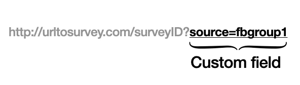
Track sources
You could also add a source. For instance, if you are spreading a survey on multiple Facebook groups, in this way you can see where people are finding your survey, without the need to ask that question.
Increase conversion
I’ve used custom fields to increase the conversion rate of emails. Recognise these types of emails?
You can put your first question in the email with hyperlinks. In this way, people are automatically in your question flow.
This is what I do at the bottom of my newsletters. Instead of saying: “please click here to complete a survey”, I ask: what did you think? Increases conversion.
16. Alternative tool: asynchronous video interview
When I shared a draft of this article, somebody told me about asynchronous video interviews. I’m new to this, but might be interesting to check out.
Instead of questions and radio buttons, you get videos in questions and the respondents can respond with video and audio, or questions.
This probably takes a little longer to set up but could get better engagement.
Examples:
17. Alternative tool: landing page to test value proposition
Another tip I got was to combine landing page tools with surveys. This would be beneficial for value proposition testing and gathering extra information.
Tools to create simple landing pages are listed below, instead of a purchase page, you could add a link to your survey.
Examples
18. Getting respondents via ads
Online and social ads are a great way to get in contact with your potential audience. Bear in mind that ads sources have biases.
When I worked at Werkspot, we could see different behaviour for people that came in via Bing ads vs Google Ads.
Tip: Think about what claims you make versus what you can offer.
Some people might get frustrated that you claim to sell ‘a new fantastic product that solves your problem’ while you have just a survey to offer.
? Jeroen’s spicy hot take
Why do most surveys suck?
Firstly, schools don’t teach how to make pleasant surveys. Most universities that teach surveys do this from a scientific perspective.
This is for scientific results with high rigour. Most startups don’t need this. Startups can cut some corners. They are not trying to publish a paper, find 0.001 significance, nor do fancy ANOVA calculations.
Secondly, a lot of the surveys designed are made by people that are new to making surveys. Most of the time these people don’t realise they are designing a website that needs to be pleasant.
They approach it from the needs of the startup, not the needs of the user. Put on that user hat, baby.
Another thing, nit-picky, but when I say survey, I actually mean questionnaire. The survey is the whole investigation, of which a questionnaire can be a part. But everyone calls it a survey, including me. But before the comments come on, I beat you to it.
When to do surveys
Ask yourself: Do I need these answers codified in a spreadsheet with high comparability between all responses? Or can I be the database that interprets the results and shares them with my team?
I would use surveys for automated information gathering and highlighting red flags in product experiences. I would only start deploying this when manual follow-up calls are too time-consuming.
Werkspot had thousands of customers each month. I couldn’t phone them all. Still, I phoned a few next to the quantitative results that came in.
If you run your first pilot with 10 customers, don’t send them a Google Form afterwards. I would follow up with a phone call and talk with that customer for 30 minutes. Who cares whether their answers are codified in a spreadsheet?
Write down your main conclusions of that conversation in a document, repeat this for each user. I think that is much more valuable than sending a Google Form.
Conclusion
In this blog, Jeroen shared just one of the many perspectives he has regarding the topics of start-ups. To discover more of his content, subscribe to his newsletter! There you can discover a range of topics; from analyses of start-up case studies to helpful tips on how to engage your customers better.